SUMMARY /
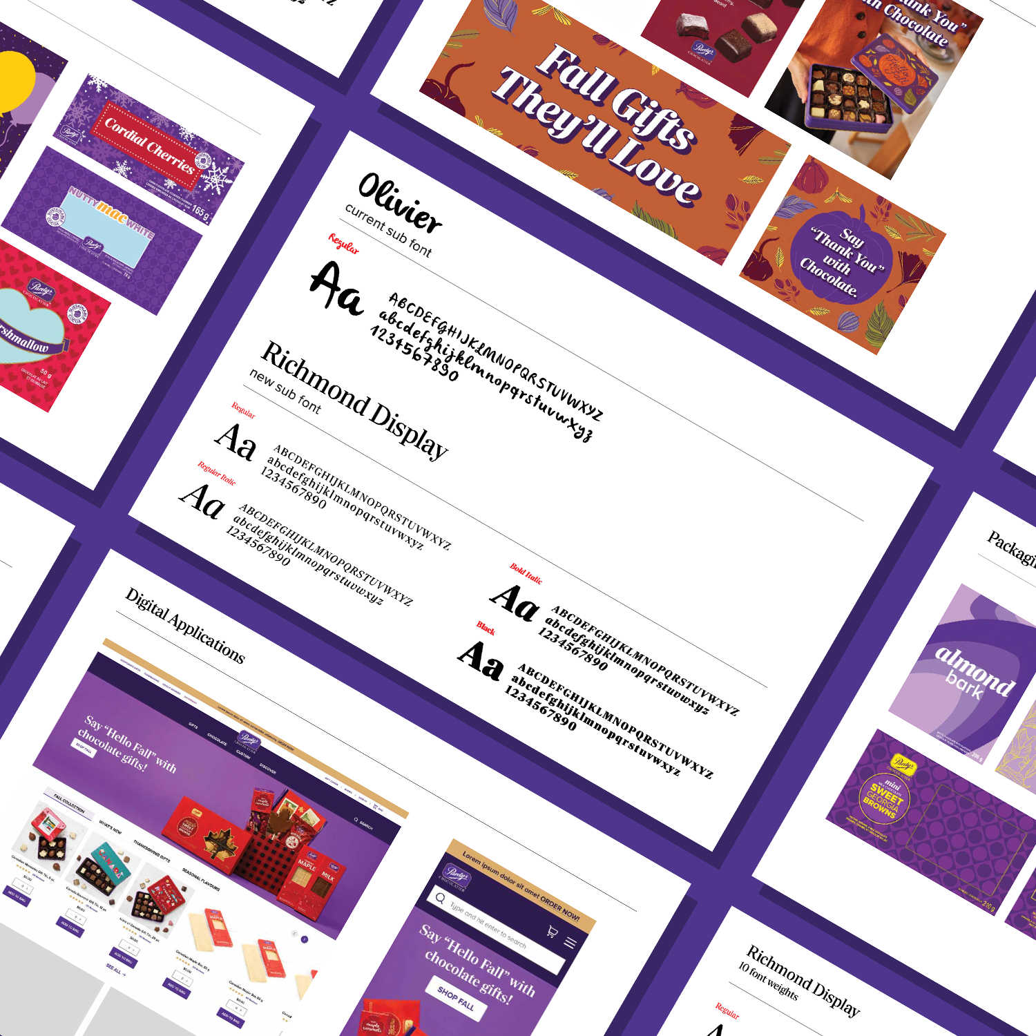
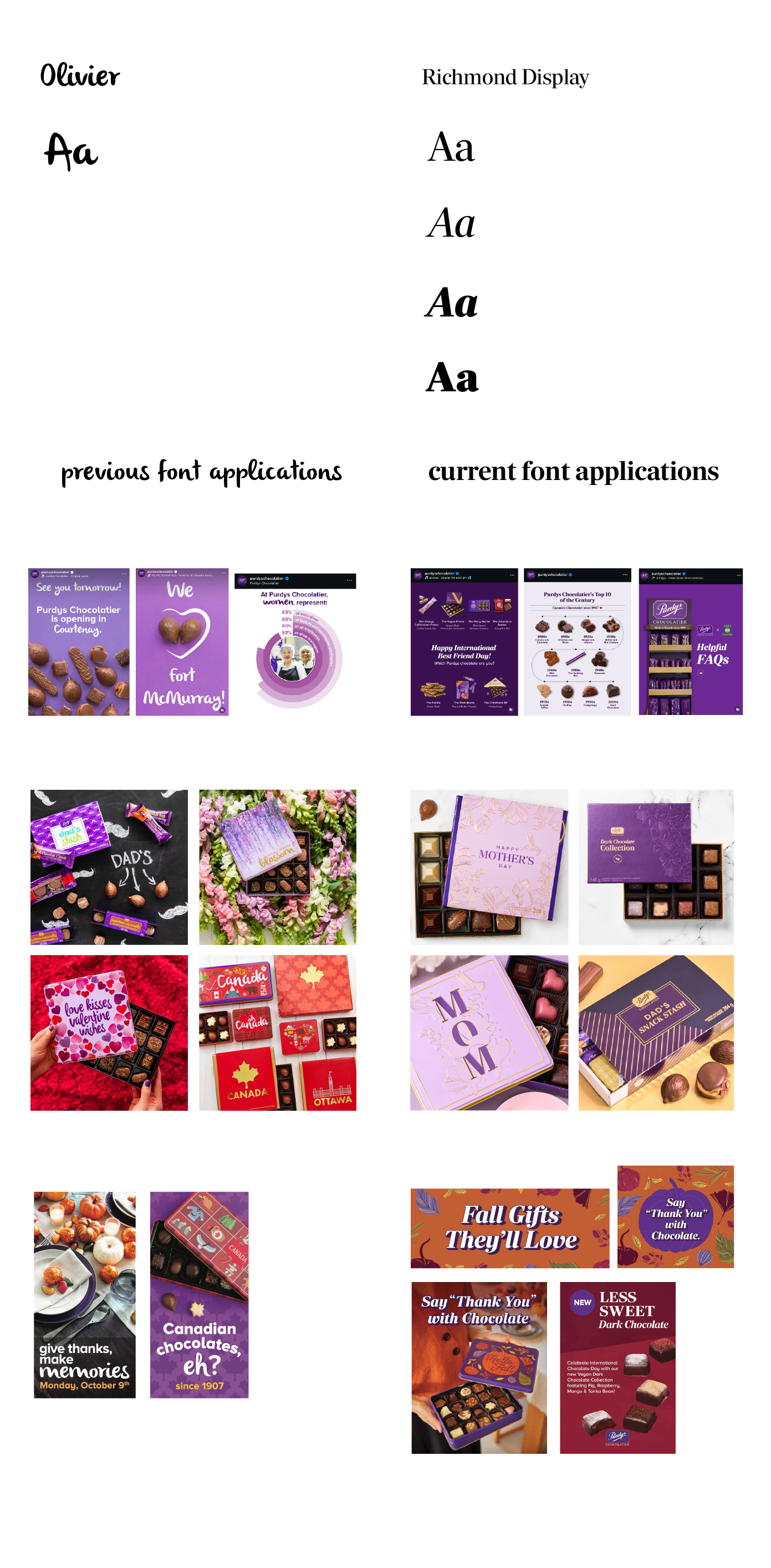
As Purdys has evolved over the years, its typography struggled to keep up. Different fonts were used across marketing, digital, and internal channels, resulting in an inconsistent brand voice and a visual identity that no longer reflected the company’s growth towards a premium look.
I researched and evaluated several typeface families with a focus on legibility, versatility, and alignment with brand personality. After careful consideration, I introduced a new corporate font system that works seamlessly across both print and digital applications.
PROJECT TASKS /
Select a typeface that balances professionalism and approachability
Establish hierarchy guidelines for headings, subheadings, and body copy
Apply the font across presentations, social media, web, and marketing collateral
Create a typographic style guide to ensure brand-wide consistency
OUTCOME /
Strengthened brand recognition with a unified, premium look
Improved readability and accessibility across digital platforms

